
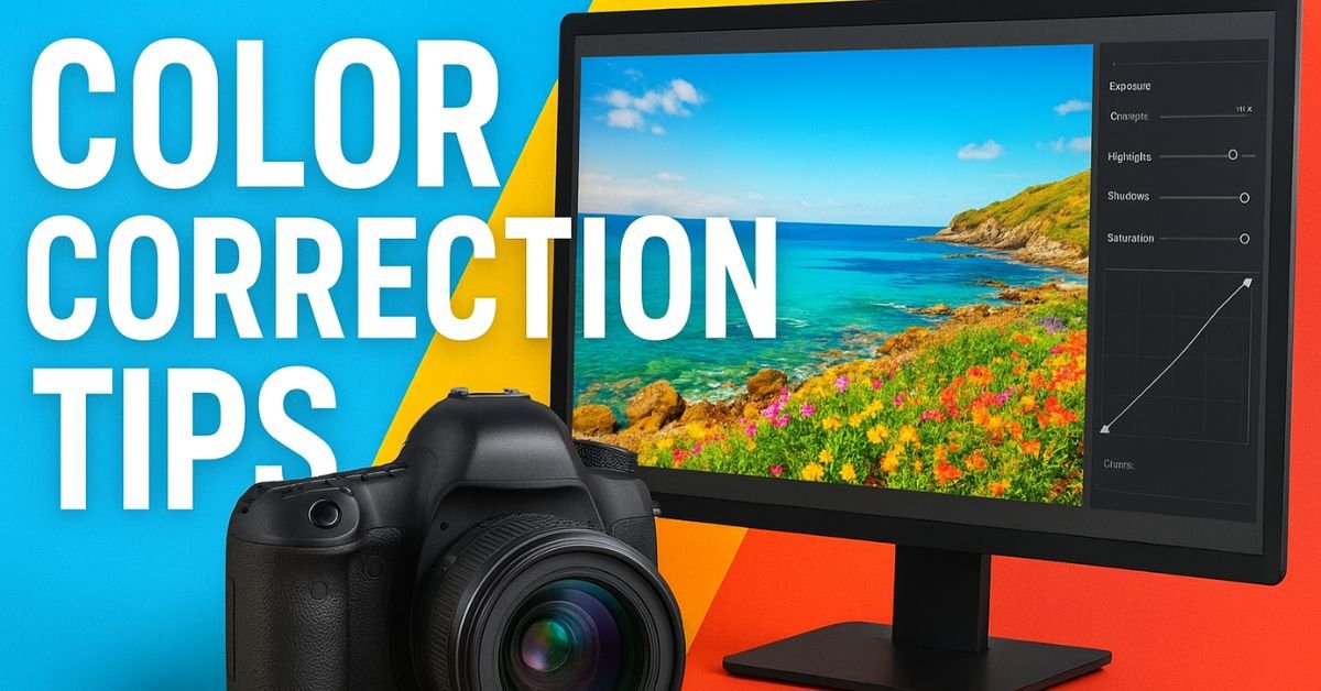
Color correction is a crucial part of photography that can transform your ordinary photos into visually stunning works of art. Whether you are a professional photographer or an amateur enthusiast, understanding how to correct colors in your photos ensures that your images look natural, vibrant, and polished. In this comprehensive step-by-step tutorial, we will guide you through the process of color correction using popular tools and techniques, helping you achieve flawless results.
What is Color Correction in Photography?
Color correction is the process of adjusting the colors in an image to make them look more accurate and visually appealing. This involves fixing color casts, enhancing vibrancy, balancing whites, and improving overall contrast. Proper color correction ensures that the colors in your photo reflect reality or your desired artistic style.
Why Color Correction is Important
- Enhances visual appeal: Balanced colors make your photos more attractive and professional.
- Fixes lighting issues: Corrects problems caused by poor lighting or incorrect camera settings.
- Maintains color consistency: Essential for brand photography, product images, and social media content.
- Improves mood and tone: Color adjustments can convey emotion and set the desired atmosphere in your photos.
Step 1: Choose the Right Software for Color Correction
Before you begin editing, you need to choose a reliable photo editing software. Here are some popular options:

- Adobe Photoshop: The industry-standard tool for professional color correction and advanced edits.
- Lightroom: Perfect for batch edits, RAW processing, and precise color adjustments.
- GIMP: A free and open-source alternative for color correction.
- Affinity Photo: A budget-friendly option with advanced color correction tools.
Step 2: Start with White Balance Adjustment
White balance is the foundation of accurate color correction. It ensures that the whites in your photo appear neutral, which naturally balances all other colors.
How to Adjust White Balance
- Open your image in your chosen editing software.
- Locate the White Balance tool. In Lightroom, it’s under the “Basic” panel.
- Use the Eyedropper Tool to select a neutral white or gray area in your photo.
- Manually tweak the Temperature (warm/cool) and Tint (green/magenta) sliders until the colors look natural.
Pro Tip: Shoot in RAW format whenever possible. RAW files contain more color information, making white balance adjustments easier and more precise.
Step 3: Correct Exposure and Contrast
Proper exposure and contrast are essential for accurate colors. Underexposed images can appear dull, while overexposed images can lose color detail.
Steps to Correct Exposure and Contrast
- Adjust the Exposure slider to correct brightness issues.
- Use the Contrast slider to enhance the difference between highlights and shadows.
- Check the Histogram to ensure your photo has balanced highlights, midtones, and shadows.
- Apply the Highlights and Shadows sliders for finer adjustments.
Step 4: Remove Color Casts
Color casts occur when an image has an unwanted tint due to lighting conditions. Common color casts include blue from shade or yellow from incandescent light.

How to Remove Color Casts
- Use the Color Balance tool in Photoshop or the HSL/Color Panel in Lightroom.
- Select the affected color range (e.g., blue for shade cast).
- Adjust the sliders to neutralize the unwanted tint.
- Compare before and after to ensure natural-looking results.
Step 5: Enhance Colors Using Saturation and Vibrance
After fixing white balance and color casts, you can enhance your image to make colors pop without looking unnatural.
Difference Between Saturation and Vibrance
- Saturation: Increases the intensity of all colors equally.
- Vibrance: Boosts muted colors selectively and protects skin tones from over-saturation.
Steps to Enhance Colors
- Increase Vibrance slightly to make the colors lively.
- Adjust Saturation carefully to avoid oversaturation.
- Use Selective Color Adjustment if you want to enhance specific colors, like making the sky bluer or the greens richer.
Step 6: Use Curves for Precise Color Adjustments
The Curves Tool is one of the most powerful ways to fine-tune colors in your photo. It allows you to adjust the tonal range and color channels individually.
How to Use Curves
- Open the Curves Panel in Photoshop or Lightroom.
- Select the RGB channel to adjust brightness and contrast.
- Switch to Red, Green, or Blue channels to correct color casts in specific areas.
- Drag the curve gently to avoid harsh transitions.
Step 7: Apply Local Adjustments
Sometimes, specific areas of your photo need targeted color correction. Local adjustments help fix problem areas without affecting the entire image.
Techniques for Local Adjustments
- Adjustment Brush: Paint over areas needing color correction, brightness, or saturation changes.
- Gradient Filters: Apply corrections gradually across skies or landscapes.
- Radial Filters: Highlight or enhance specific subjects without altering the background.
Step 8: Compare Before and After
Always review your edits by comparing the original photo with the corrected version. This helps ensure your adjustments are improving the image and not making it look unnatural.

Tips for Effective Comparison
- Toggle the Before/After View in Lightroom or Photoshop.
- Zoom in to inspect details and ensure color consistency.
- Check the image on multiple screens to confirm color accuracy.
Step 9: Export with Proper Color Settings
After completing color correction, it’s important to export your images correctly to maintain color integrity across different devices and platforms.
Export Tips
- Use sRGB color profile for web images.
- Choose the correct resolution for your platform (e.g., 72 dpi for web, 300 dpi for print).
- Save in a high-quality format like JPEG or PNG.
- Keep an editable version (PSD, TIFF, or RAW) in case further adjustments are needed.
Step 10: Practice and Experiment
Mastering color correction takes practice. Experiment with different tools, lighting conditions, and color styles. Over time, you’ll develop an eye for what looks natural and aesthetically pleasing.
Additional Tips for Better Color Correction
- Shoot in RAW format whenever possible for more flexibility.
- Use calibrated monitors to ensure accurate color representation.
- Study color theory to understand complementary colors and contrast.
- Learn shortcuts in your editing software to speed up workflow.
Conclusion
Correcting colors in your photos is a fundamental skill that every photographer should master. By following this step-by-step tutorial, you can fix color imbalances, enhance vibrancy, and achieve professional-looking images. Remember, the key is to start with white balance, adjust exposure and contrast, fix color casts, and then enhance colors carefully. With practice and experimentation, color correction will become second nature, making your photos stand out and resonate with your audience.
FAQs About Color Correction
1. Can I correct colors in JPEG photos?
Yes, you can, but RAW files provide more flexibility and better results because they contain more color information.

2. Should I always increase saturation?
No, over-saturation can make images look unnatural. Use vibrance for a more subtle and balanced enhancement.
3. Is color correction different from color grading?
Yes. Color correction aims to make colors accurate and natural, while color grading adds a stylistic look or mood to the image.
4. How can I learn advanced color correction techniques?
Practice using professional tools like Photoshop and Lightroom, watch tutorials, and study photography courses focused on color management.